
 WIEC
Fat Free Radio
WIEC
Fat Free Radio Not the same old thing
Programming
About WIEC-FM
Community
SARS-COV-2
Our Alternative
If you have questions about the station, have time or funds to donate or you would like to volunteer to help grow the station, Email UsSARS-CoV-2 Graphs
These graphs are
Comparisons of Crona Virus cases in the United States, Wisconsin, and
Eau Claire County
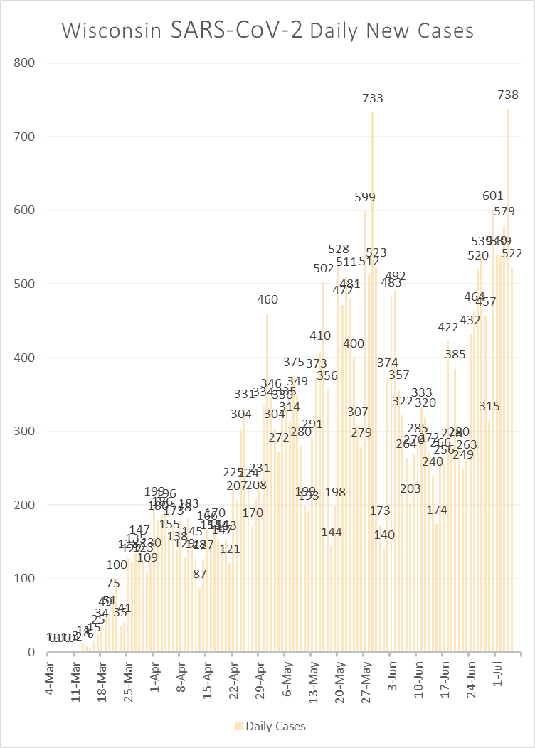
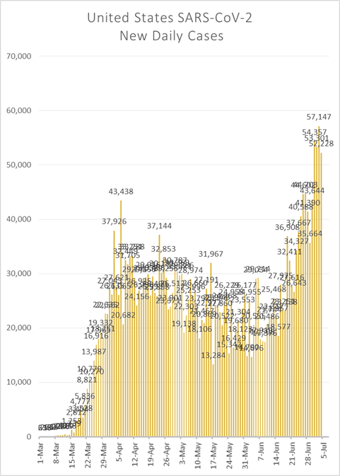
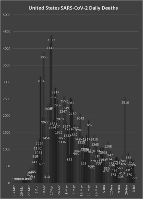
We ended our graphing after the 4th of July. There are more and better graphs online than ever before (see resources below). At this stage it is clear that the United states had a very poorly managed, out of control Covid catastrophe with more cases and more deaths than any other country. Bungling, late response, mismanagement and early reopening all contributed to more than 50,000 needless deaths in the US.
If you think politics don't matter, think again.
The good news, as the graphs below show, is that distancing and masks make a difference. Education makes a difference. The death rate per number of cases is dropping even as the number of new cases increase day by day. Our medical system is catching up even as the situation worsens.
Some recommended videos for anyone wanting to understand pandemics:
-
The Current Graph from the video above. A MUST SEE is the linear equivalent graph.
More good graphs:
AS OF July 5th
July 5 |
US * Infections |
US * Deaths |
WI Infections |
WI Deaths |
Eau Claire Infections |
Predicted |
> U.S. Population |
> U.S. Population |
> WI State Population |
> WI State Population |
> County Population |
Actual |
2,841,906 |
129,576 |
31,577 |
796 |
284 |
The Blue Lines on the graphs below and the predictions above show what would have happened if we ignored the CDC's warnings and treated Covid-19 like the seasonal flu. The predicted and actual numbers show a strong correlation until about 4/4 for the infection rate when the two diverge. The mortality rates diverge about one week later. Wisconsin began to “Shelter-in-Place” on 3/24, 11 days earlier. |
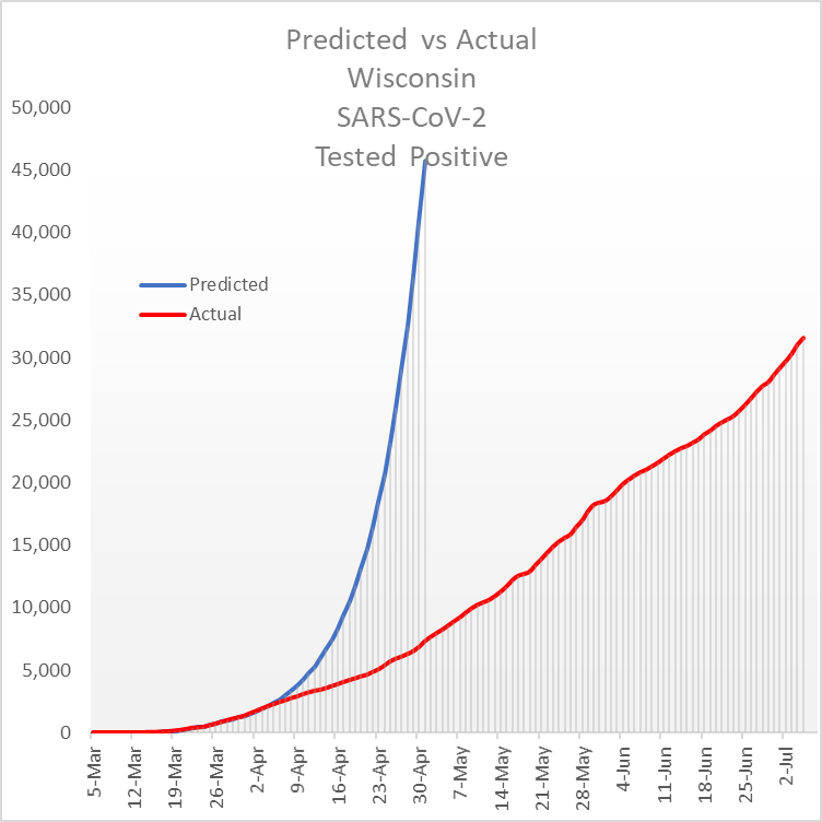
This Wisconsin graph of Predicted Positive test results for Covid-19 used an R0 of 1.4 to calculate the Blue line until March 21.
To match a significantly slowing infection rate
From March 22 forward an R0 of 1.19 was used
From March 28 forward an R0 of 1.12 was used
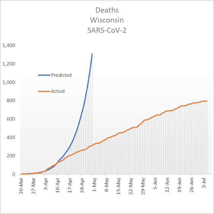
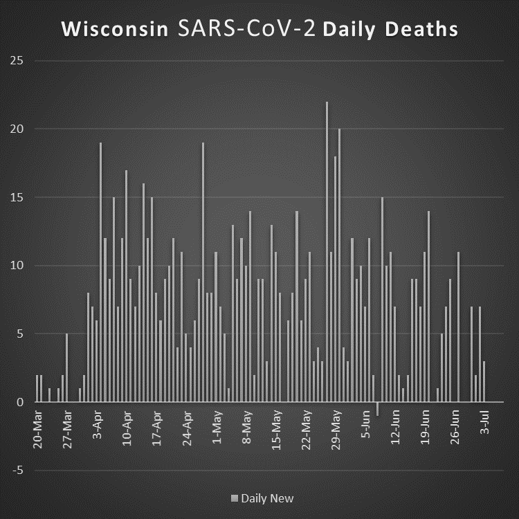
This Wisconsin graph of Covid-19 mortality above used an R0 of 1.3 to calculate the Blue line until March 24.
To match a significantly slowing mortailty rate From March 25 forward an R0 of 1.2 was used
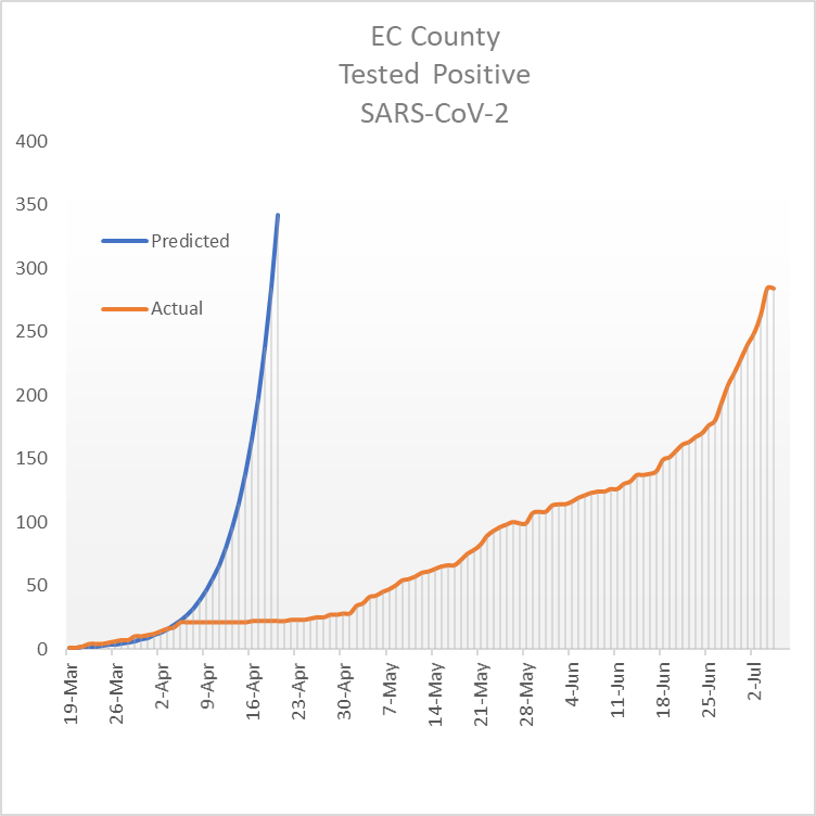
The Eau Claire County graph above of Predicted Positive test results for Covid-19 uses an R0 of 1.2 to calculate the Blue line.
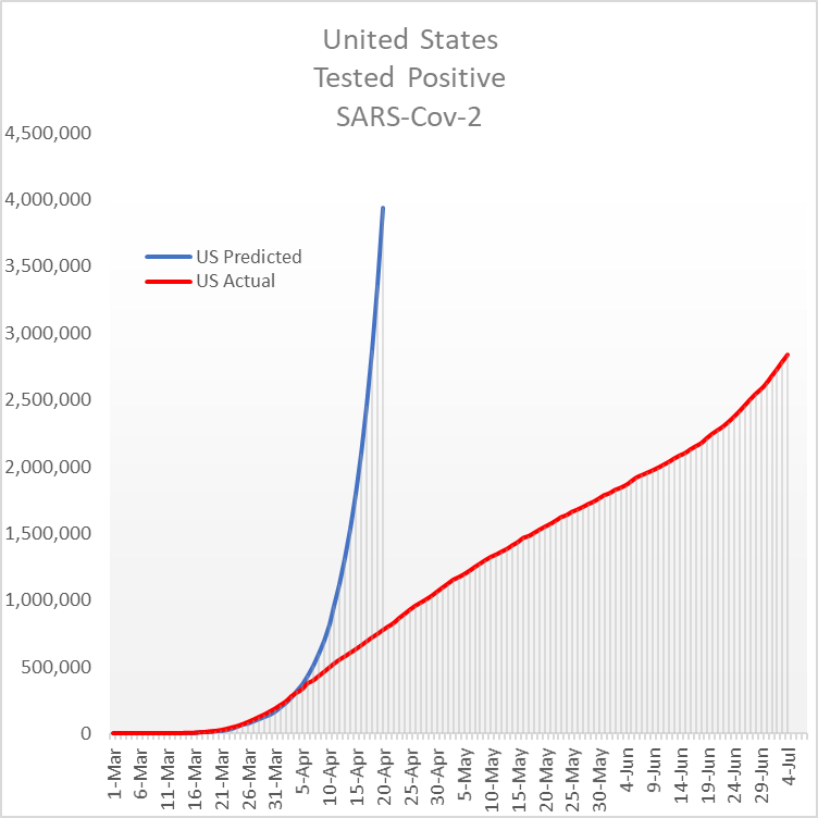
This US Graph of Predicted Positive test results for Covid-19 initially used an R0 of 1.3 to calculate the Blue line. The actual number of cases in Red closely tracked this value.
To match a significantly slowing infection rate From March 26 forward an R0 of 1.17 was used
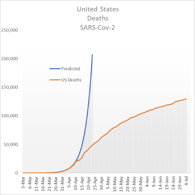
The US Graph of Predicted mortality for Covid-19 above initially used an R0 of 1.3 to calculate the Blue line. The actual number of cases in Red closely tracked this value.
To match a significantly slowing infection rate From March 30 forward an R0 of 1.2 was used
If you have questions about this page, please let us know
WIEC@WIECradio.org
Call: 808-400-WIEC